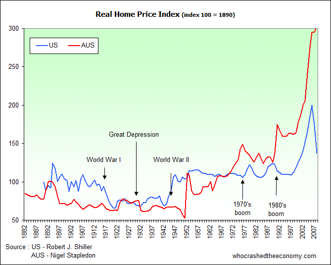
The Financial Times has an interview with Jeremy Grantham, founder and chief strategist at GMO, on bubbles.
Mr Grantham has identified over 34 bubbles over the years based on the 40 year event based from price and volatility. At present 32 of the 34 bubbles have moved back to trend before the bubble existed, with the Japan asset bubble, Tech Wreck and more recently the U.S. housing bubble included in these. He says the U.S. housing bubble was a good example of an ideal bubble.

He says two bubbles remain in play at present. These are the Australian housing bubble and the U.K. housing bubble. He believes mortgage rates came down significantly to protect these two bubbles and now we have to wait and see what happens when interest rates rise. If they don’t come down to the trend line multiple of family income, it will be the first time in history that the bubble hasn’t broken. (I guess property speculators here, do say Australia is different and it won’t happen here!)
He also identifies potentially forming bubbles as commodities and emerging market equities. Commodities could come as another blow to Australia.
Watch the interview here – Apr-19-Jeremy-Grantham-on-bubbles.

I am afraid it doe not matter how much rational history and thought is presented, the fools in Australia will never listen, only last week I overheard two co-workers chatting at the lunch table over how they are going to borrow to buy investment properties and go with negative gearing, I asked them why they would not consider shares and they replied “shares can go to zero”, I responded with “well technically if a house price slumps below what you have paid, then isn’t that the same thing?”. The did not agree, saying that the house would still be there…… “I guess that makes it easier to repossess I replied”
I feel it is a real emotional thing, to blind yourself to the plain reality of what mathematics tell you apparently a negative value is ok so long at the item is still “there”. It’s just sad that the government seems intent on causing the biggest bust in Australian history.
For a bit of a laugh before the “big one hits” checkout this old Spitting Image video on YouTube, it is based on the 80s realestate crash that took place in the UK during the Thatcher years. Its funny, but the underlying message is a current as ever.
http://www.youtube.com/watch?v=azxNL-T3IFQ
warning, this may be a stupid question. I’m wondering why the graph only goes to 2007? How do the last couple of years look on that graph?