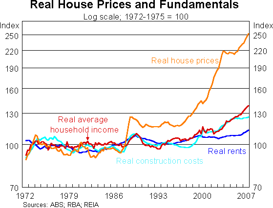
If a picture is worth a thousand words, today’s graph would suggest I don’t have to write a column this week. The graph was put together by the Reserve Bank’s head of economic analysis, Anthony Richards, and tracks the movement in house prices over the past 35 years compared with movements in rents, household income and construction costs.

Something is way out of kilter, and the bad news for home owners is that it’s not that new entrants to the property market aren’t earning enough or governments aren’t helping enough through pointless schemes such as the first-home owner grant.
The graph is similar to the one published here @ who crashed the economy, 18 months ago.
» Tread warily when you buy into the dream of home ownership – The Sydney Morning Herald, April 12th 2008.
» Some Observations on the Cost of Housing in Australia – Tony Richards Reserve Bank of Australia, May 2008.
