Long time readers of whocrashedtheeconomy.com will remember a post back on the 28th of April last year about the Herengracht Real Location Value Index created by Piet Eichholtz dating back 350 years. It tracked house prices on Amsterdam’s Herengracht canal and shows over the 350 years when corrected for inflation house prices remain flat. After every boom, there is always a bust. Eichholtz’s index has just cropped up in an ABC article :
From boom to bust, the plot Sasbout bought for 4,600 guilders (2,100 euros) and which today might sell for several million euros on the prestigious canal, will in the long run always revert to some kind of price equilibrium.
Just now for Eichholtz, the arrow is pointing down. He says home-owners worldwide may need to brace for double-digit losses in once-booming markets, and even more in places with low birth rates like eastern Europe as well as Japan and South Korea.
“I’m really concerned about housing markets where the demographics look bad,” he said. “Then prices can really fall a long way.”
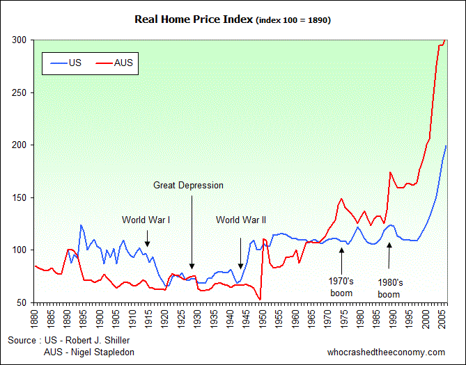
Closer to home, Nigel Stapledon, an economics lecturer at UNSW and past Chief Economist for the Westpac Bank has created a Real Price Index for Australia measuring house values of constant quality since 1880. A chart of his index is shown below along with the US Real House Price Index created by Robert Shiller.

It clearly shows the huge size of our housing asset bubble at present.
You just have to ask yourself, what happens when it corrects? That is a lot of money it has pumped into the economy through the wealth effect, home equity loans and the like. Even more frighting is that most OECD countries are in a very similar position, and as each day emerges there is talk about real estate prices falling in countries like Britain, Japan, China etc.
» Dutch history pointing to real estate fall – The ABC, 28th January 2008.
» Long term housing prices in Australia and some economic perspectives – Nigel David Stapledon, September 2007.

The graph is interesting in many ways. The fact that the US and Australia real estate markets run so parallel really surprised me.
I have to agree with Eichholtz